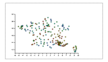
Read Data and Colour Scatter Plot
In this session we will be working with some new data. The data files we have are rrfrance.dat containing levels of precipitation throughout France:
X Y Z 5.3166666667E+00 4.5966666667E+01 2.2600000000E+01 3.1833333333E+00 4.9800000000E+01 1.2000000000E+00 3.3833333333E+00 4.6150000000E+01 6.4000000000E+00 6.0000000000E+00 4.4066666667E+01 4.5400000000E+01 6.5033333333E+00 4.4565000000E+01 4.6400000000E+01 7.1166666667E+00 4.3550000000E+01 5.8000000000E+01 6.9500000000E+00 4.3550000000E+01 8.5800000000E+01 7.1833333333E+00 4.3633333333E+01 4.1000000000E+01 7.3166666667E+00 4.3666666667E+01 9.0000000000E-01 4.3733333333E+00 4.4540000000E+01 1.8600000000E+01 4.6333333333E+00 4.9783333333E+01 4.2000000000E+00 1.0833333333E+00 4.3000000000E+01 2.0000000000E+00 ... |
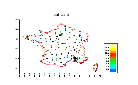
and france.dat - the coastline of France:
regx   regy
      9.343     43.034
      9.432     43.002
      9.443     42.856
      9.454     42.719
      9.454     42.605
      9.498     42.442
      9.553     42.238
      9.520     42.090
      9.454     41.967
      9.421     41.827
      9.377     41.745
      9.343     41.638
      9.310     41.588
      9.277     41.563
      9.222     41.472
...
|
Read both of these files in using the report reader
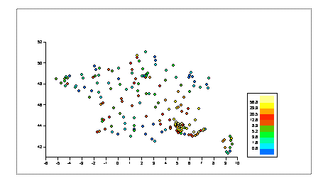
Right click on the Graph icon select scatter. Set the X data to be X, Y Data to be Y and Color to be Z. Click on OK.
In the browser enable the legend for this viewport.
Click on one off the scatter points and then create a line graph with X data set to regx and Y data set to regy. You will notice that the legend no longer shows the colour scale. Edit the legend and set the Legend Type to be "Continuous".
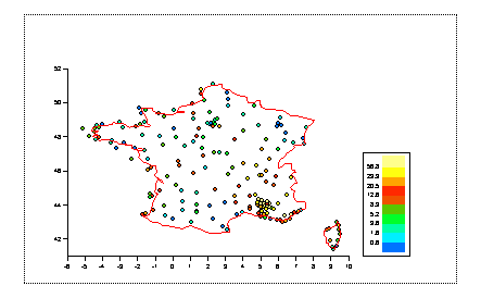
Give the viewport a title
We will now find out our to contour our data