User Interface |
This chapter includes a general introduction to the User Interface ("UI") Kit and demonstrates how to create common application user interface components using tutorial-style examples. Using example networks, this chapter illustrates how to create common components of an application's user interface from objects in the User Interface (UI) library.
For additional examples, including wrapping the user interface objects into a macro and connecting them to application parameter values, see the tutorials in the Visualization Techniques manual, and the User Interface "sampler" application in Examples.UIApp.
The V code that defines this application is in examples/ui_samp.v. The files that define the user interfaces for: the Data Visualization Kit modules is v/modules.v; the AVS5 Compatibility Kit modules is v/ACUmods.v; the Graphics Display Kit panels is v/view.v
The User Interface ("UI") Kit provides widgets for building complete interfaces to AVS/Express applications.
The UI is manipulated using objects, modules and macros in the Network Editor. UI components (sliders, windows, etc.) are AVS/Express objects. Building a user interface to an application consists of creating a UI layout (UI hierarchy, position, dimension, color, etc.) by instancing UI objects and manipulating their subobjects. The application is "wired up" by attaching the data referenced in function objects to the data stored within a widget.
All AVS/Express applications have an application shell (UIapp or UIshell). The application shell has a managed window, window manager decoration, a pull-down top level menu bar, and a context-sensitive help message display region.
All interactive interface objects exist in a class hierarchy that permits considerable leverage of the base type objects. Abstract elements are not instantiated directly by the developer, but are used as base objects and classes for the basic interface objects.
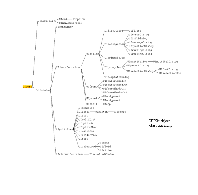
The User Interface Kit's object class hierarchy is shown in the figure on the following page. Note that some objects (UIoptionBox, UItoggle) use multiple inheritance.
|
UI widgets are defined as V-code in v/UI.v. Although the UI can be controlled through the Network Editor it can be useful to see the v-code that makes up the UI-widgets.
The User Interface Kit allows you to create complete graphical user interfaces for your applications. Depending on personal preference and the standard application (SingleWindowApp and MultipleWindowApp, and so on) on which you intend to base your application, this can either be implemented in one or more application shell windows, or integrated into the Module Panel provided by the SingleWindowApp and MultipleWindowApp DataViewers (or the ModuleStack).
Because an application-shell, window-based user interface offers greater flexibility and functionality (including support for the use of menubars and pulldown menus) this first tutorial shows you how to build such a stand-alone interface, showing you how to create a simple application interface with a menubar, pulldown menus, pushbuttons, and a variety of other widgets in an application shell window.
The procedure for building an integrated interface is very similar to that outlined in this section. If you want to create an integrated application interface, you should still read this tutorial first to learn the general principles involved and then refer to Creating an Integrated Application Interface1-21.
Because the SingleWindowApp and MultipleWindowApp and the ModuleStack applications all offer integrated Module panels not required when building a standalone interface, DefaultApplication is the most appropriate application in which to work.
Create an application shell by instantiating a UIapp container in an application workspace.
The application workspace object and the UIapp shell should appear as follows.
The application shell can have a menubar with pulldown menus. These menus can have buttons that control other parts of the application or activate additional pulldown menus.
Create the menubar by selecting the UIcmdList object in the Menu Bar library and dragging it into the application workspace. Connect the output port of the UIcmdList object to the menu input port of the UIapp shell object.
An empty menubar appears in the top half of the UIapp shell.
Add pulldown menus to the menubar with the addition of UIcmdList objects. There is probably already one UIcmdList object in the menubar.
A UIcmdList#1 menu item appears on the menu bar. Adding additional UIcmdList objects to the first UIcmdList adds additional menubar items.
The AVS/Express menu system is built from UIcmdList, UIcmd, and UIoption objects. The choice of UIcmd or UIoption objects depends on what action you want a particular menu item to take.
The UIcmd has a do output port that is set to 1 when the button is pressed. This output is useful for controlling an object such as a UIdialog that has its own control to pop it down.
The UIoption object has a set port in addition to the do port. This allows you to set two states, 1 and 0. This can control the visibility of overlaid UIpanels, for instance, by controlling both states from the same button.
You can intermix UIcmds and UIoptions on the same pulldown menu. If the UIcmdList radioBehavior parameter is set to 1, only one UIoption is set at a time.
You create pulldown menus by adding UIcmd, UIoption, or UIcmdList objects to the pulldown UIcmdList on the menubar. A pulldown menu can have any number of items in it.
Use a UIcmd object to add a push button on a pulldown menu.
It now displays a pulldown menu with a UIcmd push button.
Use a UIoption object to add a toggle button to a pulldown menu.
It now displays a pulldown menu with a UIoption toggle button.
The pulldown menu item can control an action elsewhere in the application. The control output of the UIcmd object can activate a message dialog.
A UIinfoDialog window appears on the screen.
The pulldown menu system on a UIapp or UIshell may contain more items than is practicable to view in one long list. In these cases, you can divide the menu into submenus by the use of cascading menus.
The pulldown menu on the UIshell looks like the following image:
The UIcmdList#2 displays a right arrow to indicate additional menu selections will be displayed when its button is pressed. Cascading menus can continue to a depth of three. Dividing a long menu in this way makes it easier for the user to find a particular item if the design is carried out logically.
The UIhelpCmdList object always instances the Help menu in the correct place on the menubar.
The UIhelpCmdList appears on the right side of the UIapp menubar.
You can add buttons, other controls, and frames directly to the application shell window. These objects are in view as long as the application shell is visible.
Button controls are used to send an event to another object. The do output port of the UIbutton is set to 1 when a button widget is pushed.
A toggle switches a state between 1 and 0. The set output port of the UItoggle switches between the two states each time the toggle button widget is pressed.
The UImessageDialog shell becomes visible. To pop it down you must press the OK or Cancel button on the UImessageDialog shell.
The UImessageDialog shell becomes visible or invisible as the set state changes in response to the button pushes.
The UItext object provides for user input of string values. UIlabel objects display the string from the "label" subobject. The UIlist object allows the selection of an item from a list of string items.
Two strings appear in the UIlist window on the UIapp shell. The order of their placement is dependent on which parent connection is made first.
The selected string appears as the new UIlabel text on the UIapp shell window. Note that the default label alignment centers the label string.
Field, dial, and slider objects allow the application to interact with the user to set and get input values for numeric data. The UIfield object is used where a numeric type readout and keyboard input is appropriate. The UIdial and UIslider have pointer manipulated components that indicate data values.
Changing the value of any one of the UIdial, UIfield, or UIslider objects changes the value of the other two objects connected to it.
The UIradioBox and UIoptionBox create panels of UIoption buttons. The UIradioBox creates a mode in which only one button is set at a time. The UIoptionBox allows multiple buttons to be set at a time.
Two toggle buttons appear on the UIapp window. Only one toggle can be set at any time.
Two more toggle buttons appear in the UIapp window. Each of these buttons can be set and unset independently of the other.
You now have completed adding the radio boxes
This covers grouping UIobjects, positioning panels and frames, and controlling visibility.
You can lay out UIobjects on a single UIapp or UIshell window in a flat organization, but it is generally better to organize the interface in some modular fashion. A UIpanel or UIframe can assist in this organization by providing a container that can hold other UI objects relative to itself. Moving or changing the visibility attribute of the container object affects all the objects contained by it. This makes it simpler to act on groups of objects.
The UIscrolledWindow is another object that you use to organize your objects. It acts as a viewport window into a usually much larger virtual window. Scrollbars move the viewport over areas of the virtual window, exposing the objects in those areas.
You can nest UIpanels, UIframes, and UIscrolledWIndows within each other creating a hierarchy of objects. The position of UIobjects within each frame or panel is relative to the origin of that frame or panel. It is easier to create and test smaller panels first, and then combine these into a larger interface design.
When a UIpanel or UIframe is made invisible, by setting its visible subobject to 0, all contained UIobjects are also invisible. This allows multiple panels or frames to exist in the same window location, each being made visible when needed.
Dialogs are popup windows that inform the user of an action or ask for input. The AVS/Express User Interface Kit has ten predefined dialog types and a template dialog that you can customize.
There are two categories of Predefined Dialog objects in AVS/Express. The first group comprises message dialogs, used to inform the user of a condition or change of state of the application. The second group is prompt dialogs where the user is requested to provide some information or action response.
The message group contains the following objects:
The message subobject specifies the string that appears in the dialog box. The following example demonstrates the typical use of these dialogs.

|
The prompt dialogs are more varied in behavior than the message dialogs. Prompt dialogs include: UIfileDialog, UImultiSelDialog, and UIpromptDialog.
The predefined UIdialog objects are in the Dialogs library.
The predefined UIdialogs are generally sufficient for most needs. Occasionally, you need a more complex or specialized dialog. The UItemplateDialog consists of two buttons and an empty work area that can be populated with other UI objects.
A UItemplateDialog shell appears with the default OK and Cancel buttons.
The UItemplateDialog window resizes to fit the UIpanel window.
The UIbutton connected to the UItemplateDialog object positions itself between the existing OK and Cancel buttons. The UIbutton connected to the UIpanel object is positioned in the upper left corner of the dialog window.
Objects parented to a UIpanel or UIframe child of the UItemplateDialog will position normally inside the parent container object. Non-container objects parented to the UItemplateDialog itself are positioned between the OK and Cancel button widgets. This is how you extend the number and function of the buttons on a custom dialog.
The Layout Editor allows interactive positioning and sizing of user interface widgets using the mouse pointer and buttons. Widgets can be grouped and moved or resized as a unit.
This action turns on the move/resize handle that appears as a black outline with six "handle" boxes. The widget is now "selected" for a move or resize operation.
If the selected widget is a UIpanel or UIframe, selecting the Group menu item from the UI Builder menu of the main AVS/Express window causes all of the widgets on that container object to be non-individually selectable. The Ungroup menu item reverses that state.
When a widget window is selected, the window can move or resize through mouse interactions.
The widget is reparented on the new window.
The widget is resized to the size of the layout frame.
You can create an application interface integrated with either the single and multiple window versions of the DataViewer (or the ModuleStack).
The key component of such an integrated user interface is the UImod_panel object. UImod_panel is a special version of UIpanel that interacts automatically with the Module panel user interface container provided by the DataViewer or ModuleStack application in which it is instanced. To find out more about the AVS/Express DataViewers, see Chapter 3, Working with the Network Editor in the AVS/Express User's Guide.
For details on the UImod_panel object, see the on-line help.
When UImod_panel is instanced, an entry representing your UImod_panel is automatically installed in the Modules popup in the DataViewer (available from the Editors menu) or the Modules menu in the ModuleStack (as appropriate) to represent your user interface. When selected, the user interface components parented to UImod_panel become visible in the Module Panel.
A simple integrated user interface implemented in a single window Dataviewer, a multi-window Dataviewer, and a ModuleStack is illustrated in the following figure.
The procedure for building an application interface using UImod_panel is very similar to that described for UIapp and UIshell (in Creating a Stand-Alone Application Interface1-4). UI Kit objects connect to UImod_panel in exactly the same way as they do to UIapp or UIshell. The only real difference is that the Module panel does not support menubars, and UImod_panel does not therefore provide a menu input port by which the UIcmdList object can be connected.
These objects are the default front ends for USING AVS/Express as an end-user Visualization tool. They provide a possible framework for an application's user interface including a shell window, menu bar, status bar, exit functionality, toolbar, and a panel for UI editors.
SingleWindowApp's UI defines controls in a single shell window. MultiWindowApp's UI provides a single shell window for user interface controls, but each graphics display window is created in a separate shell window.
The SingleWindowApps and MultiWindowApps are designed as front ends. If you are building an application we recommend following the steps in Creating a Stand-Alone Application Interface and Creating an Integrated Application Interface earlier in this chapter.
By default the UI subobject of the application is not visible in the Network Editor. To make this object visible, select the menu toggle Network Editor Options->Show Application UI and close and reopen the SingleWindowApp or MultiWindowApp object by double-clicking on it twice with the mouse. You should then see the UI subobject of your application in the upper left hand corner.
Most of the user interface for an application is defined by the components added to the application, such as Uviewer. These objects are called the component's UI. The application UI defines containers, both UIpanels and UIcmdLists, to hold the component's UI. Connections are automatically created between the application UI and the component's UI when components are instanced.
These connections are typed into different categories so that an application object panel shows up in the right place. For example, when you drop a Uviewer object into an application, it adds several entries to the Editors menu, tools to the toolbar, and either creates a separate shell window (MultiWindowApp) or adds a window to the Windows panel (SingleWindowApp). This process is described in more detail in the User's Guide.
Although these connections are originally made automatically, you can edit them just like any other connections in the system using the Network Editor. In this way, you incrementally reorganize the layout of your application. Since these connections are created automatically, they are not displayed as visible connection in the Network Editor. You must edit them by opening the object's value and editing the path names by hand.
These connections fall into two categories.
A UIradioList is combined with a UIpanel in the application UI to form a stack. This stack serves as a container for a set of objects in the component UI that pair a UIpanel with a UIoption. The set parameter of the UIoption is connected to the visible parameter of the UIpanel. In this way, the stack maintains a list of UIpanels in which only a single UIpanel can be visible at a time. This visibility can either be controlled by a pull-down menu or an option menu. There are three stacks currently defined in the application UI: Editors, Modules, and Windows (SingleWindowApp only).
There are two different mechanisms used to create these automatic connections:
If no application UI object is defined for a particular component UI object, it acts according to its default behavior rules. For a UIshell, there are two default behaviors:
For a UIoption, the only default behavior is to do nothing when no container is found in the application UI.
In order to edit the application UI, you need to know which objects in the SingleWindowApp and MultiWindowApp define which regions of the user interface in your application. You can move and resize panels, add new panel regions, add entries to the menu bar and existing pull-down menus, and so on.
This table describes the subobjects of the UI macro for SingleWindowApp and MultiWindowApp:
Here are a few examples of different ways that you can modify the application UI:
For more information, see the file v/au.v. Also see the on-line help for UIpanel, UIshell, UIcmdList, UIradioList, and UImod_panel, and Uviewers.
AVS/Express is an object-based development environment. You are encouraged to create reusable components from the basic User Interface objects provided in AVS/Express to customize your application.
The following examples describe creating a custom Dial object based on the UIdial widget with the addition of maximum and minimum readouts. This object will allow these Dial attributes to be set from keyboard entry or from other AVS/Express objects.
Start AVS/Express and choose Application from the startup dialog, or if you have an existing AVS/Express session, start a new DefaultApplication by selecting the appropriate entry from the File->New Application... dialog, or clear an existing DefaultApplication workspace as appropriate.
The UIframe name changes to DialFrame. The object is now known to the application workspace as "DialFrame". You use this name as the reference to this object in various expressions.
A portion of the UIdial widget appears in the DialFrame. The size of the DialFrame is not large enough to fully enclose the UIdial widget. You will set the UIdial height and width to depend on the size of the enclosing DialFrame. First, you will set the DialFrame to a reasonable size for the UIdial widget.

|
The UIdial should now fit closely to the to left side of the DialFrame widget:
You will now add a maximum and minimum valuator and label. Since the minimum and maximum fields are composed of a UIlabel and a UIfield, it is useful to manage their positions by connecting them to a UIpanel. This panel is then connected to the DialFrame.
The reason for encapsulating is to allow the dimensions of the parent containers to control the sizes of the children. You will rewrite the width and height fields as formulas in terms of the parent width and height. The x and y fields are also formulated in term of the parent and sibling objects to allow them to align properly when those objects change their values.
These steps size the MinLabel and MinValue objects width to 1/2 the Panel width and position them side by side.
The Panel object now has its x, y, width, and height child objects arranged according to its width and height values. If these values change, the child objects will resize to conform to the new dimensions.
Now the UIshell appears as shown in the following figure.
The MinValue and MaxValue objects have input and output ports for their value subobjects. Connecting these to the UIdial min and max subobjects enables these values to be set from the UIfield windows.
When you enter values in the MinValue field and the MaxValue field the UIdial update to show the min and max values.
The Dial macro object now appears connected to the UIshell as the larger network was before. The "Dial" macro object is similar to the built-in User Interface objects, and you can use it in the same way.
The full network of objects in the application workspace is shown below:
Often, applications consist of many user interface components. Some of these user interface widgets are visible when the application first starts up and others become visible only when the user interacts with a particular part of the application or invokes a particular function. In some cases, the user may never use that part of the application.
As an example, consider AVS/Express' SingleWindowApp with a Uviewer3D. The viewer provides a number of editors that are accessed via the Editors pulldown menu of the SingleWindowApp Data Viewer. A user may use the Data Viewer but access only the Modules Editor and the View Editor. The user might never invoke the Camera, Datamap, Light, Transform, or other editors contained on the menu. Each of these editors consists of multiple sub-panels, each of which contains many user interface widgets.
Behind every AVS/Express user interface object is a Motif or Windows widget which gets created when the AVS/Express object is instantiated (and parented, in the case of non-shell/dialog widgets. Actually, it is a little more complicated than this and there is a third case - that of menu objects, but it is unnecessary to go into this level of detail for the purposes of this discussion.) There is a performance cost associated with the creation of each Motif/Windows widget. Ideally, you would create only those widgets that are accessed by the user. The many widgets that a given user does not access during a particular session - for example, the widgets on the various editors panels, such as the Camera and Light Editor that the theoretical user above never invoked - would never be created.
This is exactly the functionality provided by the instancer AVS/Express module. The instancer module is located in the Accessories.Utility_Modules.General library. It allows you to create objects and dynamically set their instanced property on and off. For user interface objects, the state of the instanced property determines whether the underlying widget is created or destroyed.
Using the instancer module has two benefits. Firstly, it allows you to create only those widgets actually needed by the user in this particular session of your application. Secondly, it allows you to distribute the cost of creating the widgets so that you do not incur all of this performance overhead at start-up time. The user interface of the AVS/Express Data Viewers (SingleWindowApp and MultiWindowApp containing Uviewers) is implemented using instancer modules.
The following summarizes the features of the instancer module:
Another way to get better performance with the User Interface Kit is by reducing your object count, thereby reducing both the number of AVS/Express objects and the number of widgets that need to get created. One way to reduce your object count without losing any functionality in your user interface is to reuse user interface components.
In many applications, the same set of widgets is used to perform similar functions. For example, you may use a number of dialog or typein boxes that differ only by the text in the prompt string or the label on a button. In that case, it is most efficient to create that user interface once, and simply put in the appropriate string at the appropriate time, thereby avoiding the expense of creating multiple sets of widgets. Of course you will have to store any values set by the user for each separate use of the widget set.
When designing reusable UI components, follow these programming style guidelines, which apply generally in AVS/Express:
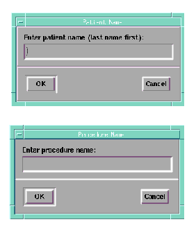
Consider a user interface consisting of these two prompt dialogs (which will never be displayed simultaneously):
|
Each dialog has a unique title, prompt string and user input but are otherwise the same.
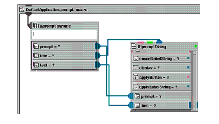
Here is what the macro for the user interface for both dialogs would look like:
|
Notice the parameter block and the parts of the user interface that reference it.
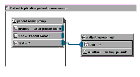
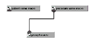
The macros for the patient name and procedure name components (user interface + module) would look something like this:
|
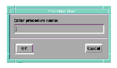
You can change which macro is connected to the user interface dynamically using Object Manager API calls or perhaps, V code embedded in a parse_v module (we advise against using many of these in your application since they make applications difficult to debug.) The appropriate user interface is displayed based on which module is connected:
|
|
It may take you a short time to become familiar with this technique of writing reusable user interface components. In many cases, the improvement in performance will be worth the effort.