Flux-Vis ACTI Project Virtual Gallery
Hyperlink to Small Dataset Page
Synthetic Data, 30x90x12 Grid, 8 Time Steps.
Sample Images From the Austin Reservoir:
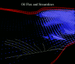
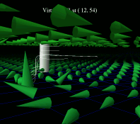 A virtual well is used as a seed point for particle advection. The user
is free to move the well about in the reservoir. This particular image shows
depth-averaged oil-flux near the surface and at the bottom of the reservoir,
as well as the paths that weightless particles would follow if released at
the location of the virtual well.
A virtual well is used as a seed point for particle advection. The user
is free to move the well about in the reservoir. This particular image shows
depth-averaged oil-flux near the surface and at the bottom of the reservoir,
as well as the paths that weightless particles would follow if released at
the location of the virtual well.
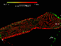
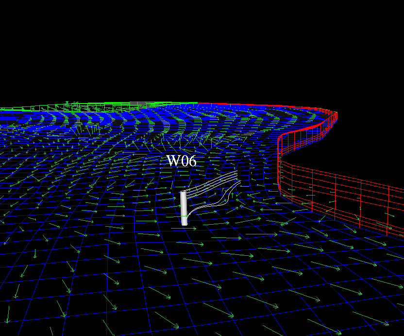
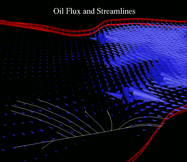
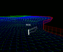 Use of a "well rake" as the starting point for particle advection/streamlines
computation. The shape of the well rake is a polyline segment. A total of
N particles are released, where N is the number of depth layers
in the reservoir model. The particles are being released into the oil
flow data.
Use of a "well rake" as the starting point for particle advection/streamlines
computation. The shape of the well rake is a polyline segment. A total of
N particles are released, where N is the number of depth layers
in the reservoir model. The particles are being released into the oil
flow data.
Additionally, layers 6-8 have been depth-averaged together (of the oil flow
data). The averaged data are shown as green flow arrows.
Ideas produced by this image:
- A virtual well would be nice. A virtual well would permit asking
questions like "what's the flow like -here-?" Perhaps a well-like rake
could become the default shape for use in 3DView?
- I seem to always want to see flow/flux arrows when I do the streamlines
and particle advection as a sanity check.
- 3dview I don't think has a "display reservoir boundaries only" option.
Might this be useful? Particularly when doing streamlines/particle advection?
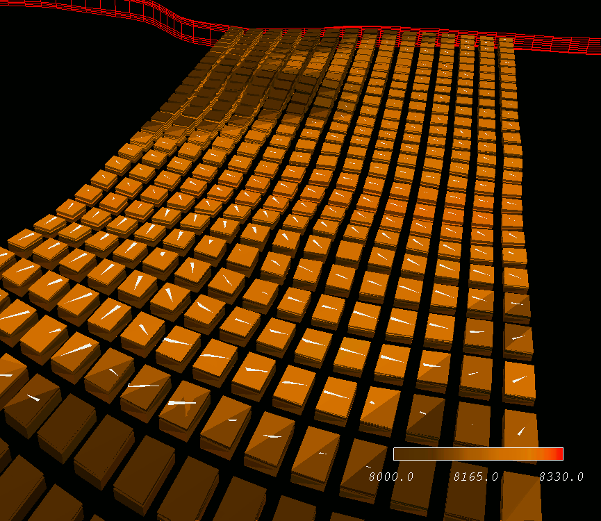
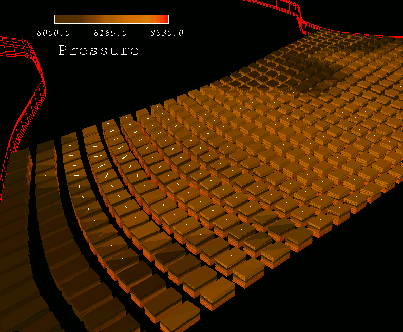
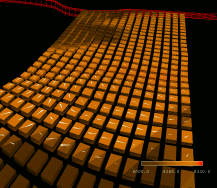 A first cut at putting flow
TRIANGLES on the grid blocks. The triangles are oil
flux, and the boxes are colored according to the pressure in the init map file.
I only put barbs on one of the 8 block faces. This image uses LOG
scaling on the triangles.
A first cut at putting flow
TRIANGLES on the grid blocks. The triangles are oil
flux, and the boxes are colored according to the pressure in the init map file.
I only put barbs on one of the 8 block faces. This image uses LOG
scaling on the triangles.
Some issues to consider (for the above image) are:
- Should the size of the triangle (or whatever icon) be proportional
to the size of the block. I can argue this either way.
- Given that the grid is not flat like a pancake, the liklihood of
the triangle icon and the face of the block actually having the same
planar equations is nil.
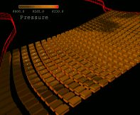 A first cut at putting flow
BARBS on the grid blocks. The barbs are oil
flux, and the boxes are colored according to the pressure in the init map file.
I only put barbs on one of the 8 block faces.
A first cut at putting flow
BARBS on the grid blocks. The barbs are oil
flux, and the boxes are colored according to the pressure in the init map file.
I only put barbs on one of the 8 block faces.
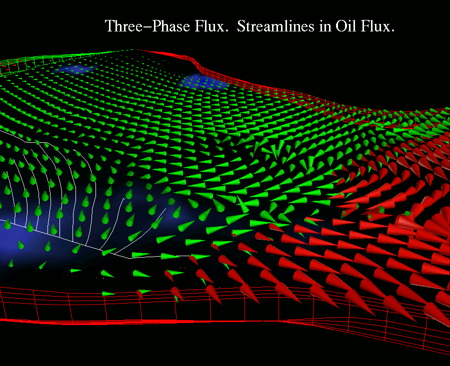
 The Cereal Picture: Here we have all the flux phases; green oil cones, red gas cones, yellow moons,
orange stars, pink hearts.... Note the use of log scaling on the cones.
The Cereal Picture: Here we have all the flux phases; green oil cones, red gas cones, yellow moons,
orange stars, pink hearts.... Note the use of log scaling on the cones.
 Oil Flux is visualized using the oriented geometric icons (cones). The streamlines track paths through the flow field based upon starting points which lie along a line, the position and orientation of which the user can specify.
 2D slice, false colored using oil flux magnitude. Cones are X-Y component of oil flux at slice=0, at the final time step produced by the simulation (forgot what the time was...I'll have to have AVS put that up on the screen).
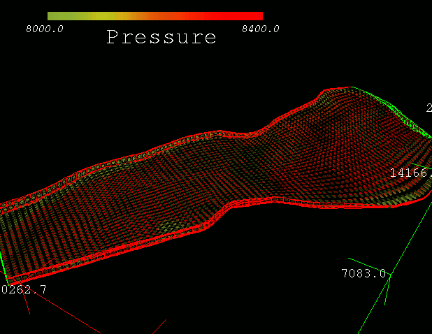
 Example of using a color ramp to depict a change in a scalar variable (pressure).
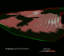 Combination of hedgehog icons and color-mapping. This technique is useful for showing spatial relationships between vector and scalar fields.
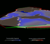 A visualization of two pressure isosurfaces, combined with color-coded transmissiblity magnitude, suggests a spatial relationship between
pressure and transmissibility.
A visualization of two pressure isosurfaces, combined with color-coded transmissiblity magnitude, suggests a spatial relationship between
pressure and transmissibility.
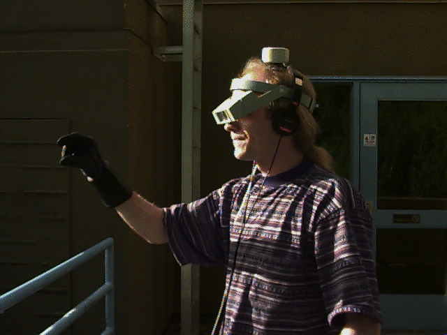
Virtual Reality Fashions
This page is maintained by ewbethel@lbl.gov.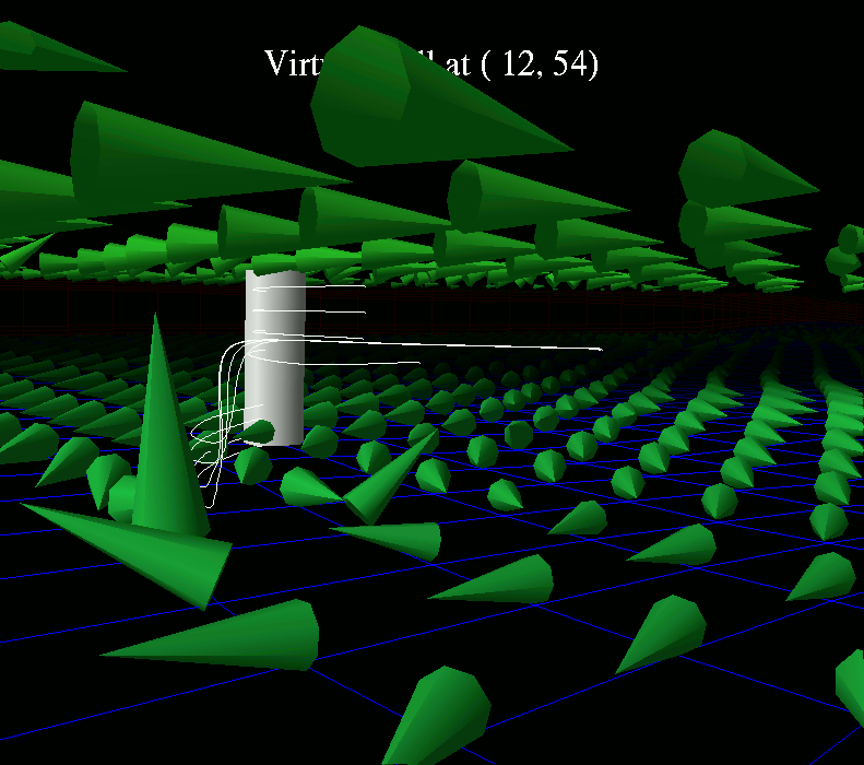 A virtual well is used as a seed point for particle advection. The user
is free to move the well about in the reservoir. This particular image shows
depth-averaged oil-flux near the surface and at the bottom of the reservoir,
as well as the paths that weightless particles would follow if released at
the location of the virtual well.
A virtual well is used as a seed point for particle advection. The user
is free to move the well about in the reservoir. This particular image shows
depth-averaged oil-flux near the surface and at the bottom of the reservoir,
as well as the paths that weightless particles would follow if released at
the location of the virtual well.
